A UX CASE STUDY

Enhancing Website Experience through Streamlined Navigation

01 INTRODUCTION

Overview

TEAM
1 x UX Designer (Myself)
1 x Front-End Developer
ROLE
UI/UX | User Research | User Testing | Wireframing | Prototyping | QA Testing
TIMELINE
Approx. 4 weeks
TOOLS
Figma | Hotjar | Google Analytics | VWO (A/B Testing Tool) | Google Forms

Background

Secretlab is a leading gaming furniture company headquartered in Singapore. Their website serves as the primary e-commerce platform for global customers. With no physical retail presence, the website functions as the ultimate shopping destination, where users are informed and engaged with compelling content, facilitating seamless product purchases. Therefore, the main navigation on the website plays a pivotal role in guiding users through browsing, education, and discovering Secretlab's offerings.

The Problem

After extensive meetings with stakeholders and closely monitoring customer support tickets, it became clear that the previous navigation system suffered from a lack of clear content hierarchy. Users were unable to determine what was important and what was less important, leading to confusion. Additionally, the navigation contained overly complex terms for branding purposes, hindering user-friendliness and comprehension. Furthermore, we identified that the navigation was not optimized for mobile use, lacking a thumb-friendly design, and the menu options were not presented in the most user-friendly manner.

The Objective

I was tasked with leading this project, which focused on streamlining and simplifying the website's content hierarchy to ensure the main navigation was straightforward and accessible to both prospective and returning customers. I prioritised various shopping methods through intuitive navigation menus. By enhancing the website's usability and responsiveness across all device sizes, I aimed to create a user-friendly environment that encouraged customer engagement, resulting in increased satisfaction and conversion rates.

02 RESEARCH & DISCOVERY

Overview

  • Research Approach
  • Stakeholder Meetings
  • CS Team Meetings
  • User Surveys
  • Heatmap Observation
  • Current State Analysis

Research Approach

To better understand the pain points and business requirements that need to be met, I conducted several interviews and meetings with stakeholders and customer support team members.

The goals of my research process were as follows:
1. Explore and identify the current user frustration points.
2. Determine the branding perspective, including what we want to show users and how we want them to navigate.
3. Identify what works from the current state and the main issues users are facing.

Stakeholder Meetings

From meetings with stakeholders, I understood their frustration that users couldn't easily identify the flagship product, which is the most expensive item. They wanted to highlight this product and its complex options, such as upholstery variations, but they also wanted to remove clutter. I argued that to effectively remove this clutter, the navigation should be designed to cater to first-time customers unfamiliar with these terms. It would be more intuitive to guide users with simpler, familiar terms, allowing them to learn about the products step by step.

After several stakeholder meetings and interviews, I gathered the UX team in FigJam for a quick brainstorming session to combine our insights from the meetings with our ideas, thoughts, and assumptions.

Meeting with Customer Support Team

From the meeting with the Customer Support Team, they explained that one of the most frequent questions they received through the online chat function was about the differences between the series of gaming chairs (our flagship product), materials, and low-priority products. This highlighted a discrepancy with our intended product introduction and hierarchy.

User Surveys

We conducted a company-wide survey using Google Forms, querying different tasks per department. Out of the entire company, 86 employees participated in the survey.

The key points we discovered were:
1) There was too much text and information to process.
2) Even Secretlab employees found certain terms difficult to understand.

These findings highlighted a significant problem and an area for improvement.

Heatmap Observation

From the user surveys and meetings, we identified similar issues to our assumptions through heatmaps and click rates. Although users interacted with the flagship products in the main navigation, other menu options showed low click rates and unclear prioritisation.
As mentioned earlier, you'll notice unclear hierarchy and complex terminology here, alongside the areas where users click most frequently. Imagine you're a first-time user visiting this website. Would you grasp the information effectively?

Heuristic Evaluation

Home (Desktop) - Default State
From our initial research, we found that the brand wants to clearly separate products and additional information within the main navigation, conveying the primary and secondary menus distinctly.
Shop Now (Desktop)
The 'Products In-Stock' CTA was initially implemented based on the stakeholders' decision to encourage quick purchases when most gaming chairs were out of stock. However, during recent business stakeholder meetings, I reviewed its relevance and noted that most products are now available.
Chairs (Desktop) - The most interacted-with menu/dropdown
Main findings and issues from this dropdown:
1) User confusion due to complex terminology and unclear routes to upholstery types and design editions.
2) Additional information only made sense to existing users familiar with the brand.
3) Secondary products were too hidden, causing confusion as they were at the same level as other additional information.
4) The only familiar, straightforward term and CTA was 'Shop all Chairs'.
In conclusion, there was too much to process in a dropdown that is supposed to be easy and straightforward.
Desks (Desktop)
There were some similar issues with the Chairs dropdown, but since there was less content for Desks, it did not seem too confusing. However, I identified that there might be some room for improvement in the overall layout and content hierarchy.
Accessories (Desktop)
Users find it challenging to understand the products listed in the current format. Improving the product order, content hierarchy, and presentation through clearer thumbnails and precise descriptions could significantly enhance the user experience.
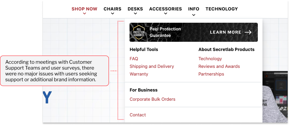
Info (Desktop)
Based on discussions with Customer Support Teams and feedback from user surveys, there were no significant concerns raised regarding users seeking support or accessing additional brand information.
Mobile Navigation Audit
Regarding the content hierarchy and messaging, the same issues were observed on mobile since the mobile version mirrored the desktop navigation. However, the primary concern with the mobile navigation was its lack of mobile-friendliness.

1) Text links were too closely spaced, which made navigation less thumb-friendly for users.
2) Limited space on mobile made the text links appear overwhelming and hard to follow compared to desktop.
3) The sales banner occupied too much space, obscuring essential elements.

03 DEFINE & PLAN

OVERVIEW

  • Problem Statements
  • Competitor Analysis
  • Ideation
  • Information Architecture

Redefined Problem Statements

Through the initial research and discovery phase, which included several meetings and interviews, surveys, heatmap observations, and a current state analysis, I gained a clearer understanding of the project objectives. As a result, I was able to define three clear problem statements that I want to tackle in this project:

1) How might we make the main navigation less intimidating and confusing?
2) How might we re-order and redesign sections so that users can immediately absorb the information intuitively?
3) How can we showcase content in a way that drives conversion, based on past learnings?

Competitor Analysis

For this competitor analysis, I focused on brands with a wide range of products and unique names, examining if they use complex terms in their main navigation for educational purposes. I prioritized mobile navigation, as a mobile-first approach ensures that information is effectively displayed on small screens and will also work well on desktop.

Information Architecture

By this stage, I had gathered a lot of information and research to present to the stakeholders. I arranged a meeting to finalise and define the brand's strategy for showcasing content to users. For example, I proposed using simple terms like 'Ergonomic Chairs' instead of specific flagship product names. However, the stakeholders emphasised the importance of familiarising users with the actual product titles. Therefore, I decided to design the navigation to make this information clear and intuitive. Below is the information architecture, which organizes the content with priority in the most understandable and intuitive manner.

04 CREATING THE FRAMEWORK

OVERVIEW

  • Wireframes

Wireframes

Now that we had established a comprehensive Information Architecture approved by stakeholders, alongside user research and data observations, I began designing the wireframes. I explored various design approaches, critically assessing their compatibility with the brand.
1. Low-Fidelity Wireframes: Layout and Content Hierarchy
I started the wireframes for "Chair," the flagship category, to test and experiment with the best layout for displaying content. The focus was on readability and creating an easy-to-follow content hierarchy, taking into account the Information Architecture developed earlier.
I deliberated whether to include Chair accessories and add-ons or to only show the chair models. Based on past research and the brand perspective, I decided it was beneficial to display Chair Accessories to introduce the entire Chair Ecosystem the brand offers. However, the challenge was to present this clearly to avoid any confusion and user frustration.
After reviewing the initial wireframes, I revisited the current state and found that the new versions are much simpler and easier to follow, featuring familiar terms and reduced clutter in the text. Now, I am considering how the navigation would appear if I remove less important content and simplify it further, so I experimented with alternative layouts.
After another round of stakeholder meetings, we shortlisted two layouts. Feedback favored the second version, which featured side-by-side thumbnails. This layout was preferred because it saved scrolling space on mobile and provided a good use of space, leading to a simple, easy-to-use navigation layout.
2. Mobile Interactions
Here are two options I considered for the mobile main navigation. I designed both versions and documented some pros and cons, taking into account previous findings, to determine which would benefit the brand the most.
3. Adapting the Design for Desktop
Now that we have a framework for mobile and an IA produced with all the research methods applied earlier, it's time to apply the solution to desktop as well. I evaluated several dropdown layouts to determine which would be the most user-friendly and beneficial for desktop users.
Here are some examples of other desktop wireframes I experimented with while settling on the shortlisted versions.

05 PROTOTYPE & TEST

OVERVIEW

  • Final Design
  • A/B Test

Final Design & Prototype

After all the variations and design experiments, here is the final design that was developed and approved by the stakeholders. For desktop, we decided to go with the vertical version as it provided a better readable flow for desktop users. For mobile, we opted for a different layout that was more suitable for mobile screens.
Referring back to the problem statements developed earlier in this project, here are the main changes and optimizations made:
  • Reduced complex terms and made the content user-friendly and easy to understand.
  • Streamlined product CTAs into single links to reduce confusion and provide a seamless journey.
  • Added clear categorization for users to immediately recognize primary and secondary products.
  • Prioritized familiar shopping terms as straightforward links.
  • Simplified and developed a completely different mobile navigation from the desktop version to provide the best experience for mobile users.
View Desktop PrototypeView Mobile Prototype

A/B Testing - Redirection Links

After the final designs and prototype were confirmed, I liaised with the front-end developer to develop the new revamped main navigation. While the developer was coding this, I decided to queue and run an A/B test to determine the best redirection link for the main flagship products. The current thumbnails led to the Features Page, where users could learn about and be educated on the products. The other option was to lead them straight to the Product Page, where they could immediately shop and configure their own products.
As mentioned in the report, we decided to keep the control version and lead users to the Features page. This approach provides users with a direct path to learn about and be educated on the flagship products before moving on to the next step, where they can configure and shop for the products.

06 FEEDBACK

& MONITORING

OVERVIEW

  • 2nd User Survey
  • Stakeholder Feedback
  • Project Summary

2nd User Survey

Once the main navigation revamp went live, we conducted a company-wide user survey to gather feedback on its user-friendliness. This time, 125 people participated in the survey.

The overall feedback regarding usability was extremely positive, with users indicating that they knew where to go even if they were unfamiliar with the product names or titles. One of the most beneficial elements was the Compare link, which significantly helped users unfamiliar with the shopping journey.

Here are some heatmaps observed, after 3 days of implementation.

Stakeholder Feedback

Although various optimisations were happening simultaneously with the main navigation revamp, stakeholders observed a clear increase in website conversion rates. Additionally, they gathered insights from other brand CEOs, such as Aftershock, who noted that the clear categorisation and upgraded version looked and felt much better than the previous version, and were more user-friendly.

Project Summary

The main navigation revamp was a project I managed independently within the UX Team. The primary challenge was ensuring consistency across all regions, as navigation is the most interacted-with component of our website.
To address this, I gathered insights from both our global audience and stakeholders, balancing business objectives with user needs. My goal was to create a seamless navigation experience for all users, including first-time visitors and prospective customers, while also strategising to improve conversion rates.
To achieve these goals, I conducted multiple surveys and engaged with various departments and stakeholders. Reflecting on the project, I believe dedicating more time to gathering insights and ongoing optimisation post-launch would be beneficial if I were to undertake this project again.

Explore More Projects